Araye Design
Overview
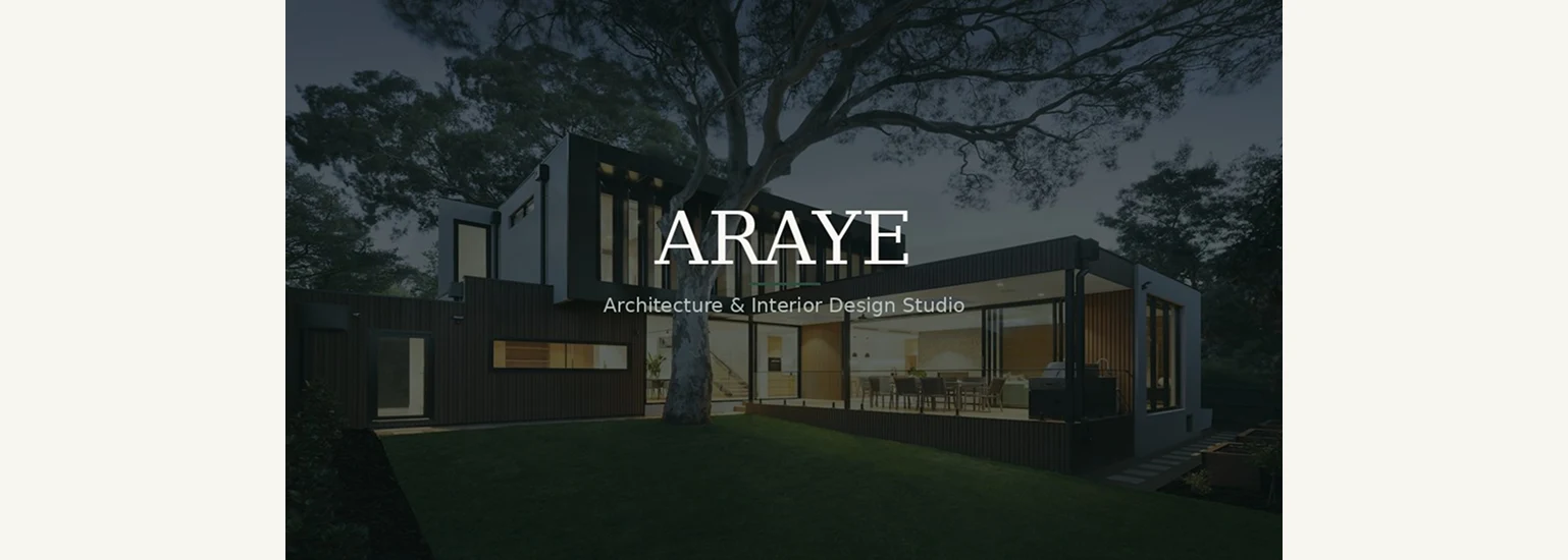
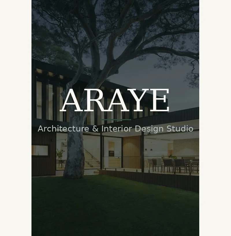
Araye Design is an interior design studio working across residential, commercial, and retail spaces. The project called for a digital presence that could hold their portfolio with the same restraint and confidence as the spaces they create. We built the brand identity and digital platform from the ground up — developing a clean typographic system, a high-contrast dark aesthetic, and a project showcase that puts photography at the forefront. The site was built in Next.js with TypeScript and Tailwind CSS, optimized for performance and designed to scale as the studio's portfolio grows. Every layout decision was guided by one principle: let the work speak.
Color System
A monochromatic foundation — seven steps from absolute black to white — anchored by three accent colors used only with full intent.
Ebony
#111111
Dark Oak
#2C2218
Umber
#5C4A36
Warm Mid
#9A8272
Sand
#C8BAA8
Canvas
#F0EBE3
White
#FFFFFF
Accent — Use with intent
Warm Brown
#7A6A50
Terracotta
#B05C3A
Typography
Five type steps — each carrying a specific weight of meaning. From 96px display headlines down to 11px product labels.
Display
84px / Light
H1
48px / Regular
H2
28px / Regular
Body
15px / Light
Label
10px / Medium
Brand Voice
Six words that form the editorial backbone of every piece of writing. The brand speaks in short, certain sentences. No warmth for warmth's sake.
- Architectural
- Confident
- Restrained
- Considered
- Timeless
- Refined
Spacing System
A fixed rhythm of eight values. Every element sits at a deliberate distance — nothing arbitrary, nothing accidental.
Next project